Mastering Color Appreciation in Hand-Painted Oil Art: Techniques to Decode Emotion, Depth, and Style
Color is the soul of hand-painted oil art, transforming brushstrokes into emotional narratives and three-dimensional illusions. Unlike digital or printed reproductions, oil paintings reveal the physicality of pigment—its layering, blending, and texture—which directly impacts how color is perceived. Whether analyzing a vibrant abstract or a muted portrait, understanding color dynamics enhances appreciation. Below, explore methods to dissect and interpret color in oil art, from technical execution to symbolic intent.
1. Observing Color Temperature: Warmth vs. Coolness in Emotional Storytelling
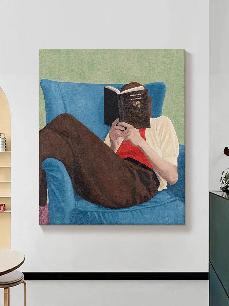
Color temperature refers to the perceived warmth or coolness of hues, a tool artists use to evoke specific moods. Warm tones—reds, oranges, yellows—create energy, intimacy, or urgency. For example, a sunset scene with deep oranges and fiery reds might convey passion or the fleeting nature of time. Cool tones—blues, greens, purples—suggest calmness, distance, or melancholy. A landscape painted in icy blues and grays could evoke solitude or winter’s stillness. Notice how artists balance these temperatures; a portrait with a warm-lit face against a cool background emphasizes the subject’s presence, while a mix of warm and cool in shadows adds realism. Ask: Does the painting lean toward warmth or coolness overall? How do contrasting temperatures interact to guide your emotional response?
2. Analyzing Color Contrast: High Drama vs. Subtle Harmony
Contrast is the juxtaposition of colors to create visual interest or tension. High contrast—placing light and dark tones side by side—adds drama and focus. A still life with a white vase against a dark tablecloth draws immediate attention to the vase’s form. Low contrast, using similar tones, fosters subtlety and calm, as seen in monochromatic landscapes where shades of green blend seamlessly. Artists also use complementary contrast (pairing colors opposite on the wheel, like blue and orange) to make elements pop. For instance, a figure in a red dress against a green field will stand out vividly. Observe how contrast is applied in different areas: Is it used to highlight a focal point, create depth, or unify the composition through gradual transitions?
3. Decoding Color Saturation: Intensity and Its Impact on Perception
Saturation refers to the purity or intensity of a color. Highly saturated hues (like vivid pinks or electric blues) command attention and convey boldness, often used in expressive or modern works. Desaturated colors (muted, grayish tones) suggest subtlety, nostalgia, or realism. An artist might desaturate a landscape to mimic the soft light of dawn or dusk, while a saturated portrait could reflect the subject’s vibrant personality. Notice how saturation varies across the painting: Are certain areas intentionally dull to recede into the background, while others burst with color to guide the eye? This interplay creates rhythm and hierarchy, shaping how viewers engage with the piece.
4. Investigating Color Layering: Building Depth Through Glazes and Impasto
Oil paint’s slow drying time allows artists to layer colors, a technique that adds complexity and luminosity. Glazing involves applying thin, transparent layers of pigment over a dried base, creating a glowing effect. For example, a blue glaze over white can produce a translucent, ethereal sky. Impasto, the opposite approach, uses thick, textured strokes that catch light and cast shadows, adding tactile dimension. A flower painted with impasto petals might seem to leap off the canvas, while glazes in the background create atmospheric perspective. Examine the painting’s surface: Can you see the buildup of layers? How does texture influence your perception of color depth and realism?
5. Interpreting Symbolic Color Choices: Beyond Aesthetic Appeal
Colors often carry cultural or personal symbolism, adding layers of meaning to a painting. Red might symbolize love, danger, or power depending on context; white could represent purity, emptiness, or mourning. In historical art, gold leaf signified divinity or wealth, while in modern works, neon hues might critique consumerism. Consider the painting’s subject and title: Does a blue landscape suggest tranquility or sadness? Does a red object in an otherwise muted scene carry metaphorical weight? Researching the artist’s background or the era’s color conventions can provide clues, but personal interpretation remains valid—symbolism is subjective and open to the viewer’s perspective.
By focusing on temperature, contrast, saturation, layering, and symbolism, viewers can unlock the hidden language of color in hand-painted oil art. Each element interacts to shape the painting’s emotional impact, narrative, and visual hierarchy. Whether studying a masterpiece or a local artist’s work, these methods transform casual observation into a deeper, more meaningful engagement with the art.