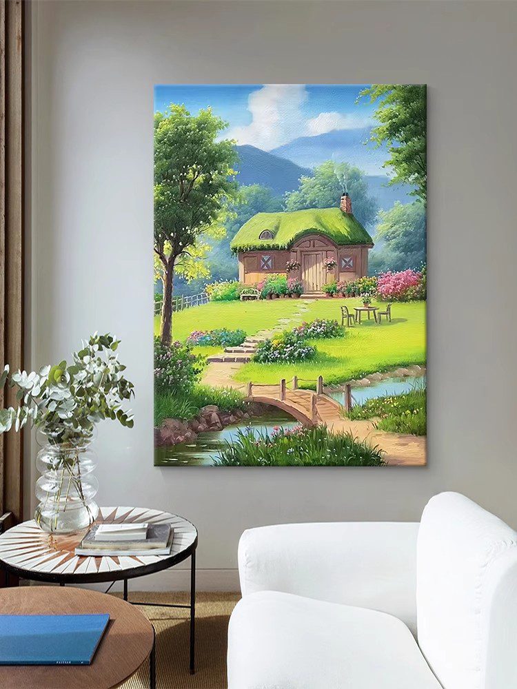
How to Adjust the Overall Color Tone of Your Visuals for a Cohesive Look
Creating a harmonious color palette in your images or designs is essential for conveying mood and ensuring visual consistency. Whether you’re editing photos, designing graphics, or enhancing digital art, mastering color tone adjustments can elevate your work. Below are key strategies to achieve a balanced and intentional aesthetic.
Understanding Color Temperature and Balance
Color temperature refers to the warmth or coolness of hues in your composition. Warm tones (reds, oranges, yellows) evoke energy and comfort, while cool tones (blues, greens, purples) suggest calmness or professionalism. To adjust this, start by analyzing the existing temperature of your image. If the scene feels overly cold, introduce subtle warm undertones by increasing yellow or red saturation in shadows or midtones. Conversely, to counteract excessive warmth, add hints of blue or cyan to highlights or neutral areas.
Balancing temperature often involves fine-tuning contrast between light and dark regions. For instance, a sunset photo might benefit from boosting warm tones in the sky while slightly cooling the foreground to create depth. Use layering techniques or gradient maps to apply targeted adjustments without overwhelming the entire image.
Leveraging Color Grading Tools for Consistency
Color grading allows you to unify disparate elements by applying a cohesive color scheme. Begin by identifying the dominant hues in your visual and decide whether you want a monochromatic, analogous, or complementary palette. For a monochromatic look, adjust all tones to variations of a single color (e.g., different shades of teal). Analogous schemes use neighboring colors on the wheel (e.g., blue-green-yellow) for a natural transition, while complementary schemes pair opposites (e.g., orange and blue) for dynamic contrast.
Use tools like hue/saturation sliders or color mixers to shift specific ranges. For example, to create a vintage effect, reduce saturation in modern neon colors and amplify sepia or mustard tones. Pay attention to skin tones in portraits, ensuring they remain natural even when applying dramatic grading.
Enhancing Mood Through Tint and Shade Adjustments
Tinting involves adding a color overlay to alter the overall perception of an image, while shading adjusts the intensity of existing tones. For a dreamy, ethereal mood, apply a soft lavender or pale pink tint to highlights and midtones. To evoke mystery or drama, deepen shadows with dark blues or charcoal grays.
When working with tints, opacity is crucial—start with a low percentage (5-10%) and gradually increase until the desired effect is achieved. For shading, use curves or levels adjustments to darken specific tonal ranges without crushing details. In landscape photography, adding a subtle green tint to foliage can enhance natural vibrancy, while a muted brown shade might give a desolate, post-apocalyptic feel.
Fine-Tuning with Selective Color Correction
Sometimes, global adjustments aren’t enough to achieve perfection. Selective color correction lets you target individual hues without affecting others. For instance, if grass appears too yellow, isolate the green channel and reduce its yellow bias. Similarly, to make a sky more vivid, boost cyan and blue saturation in the upper third of the image.
Masks and brushes are invaluable for precise control. Paint over areas that need adjustment, then apply color changes only to those regions. This technique is particularly useful for portraits, where you might want to warm up the subject’s face while keeping the background cooler.
Testing and Iterating for Optimal Results
Color adjustments are rarely perfect on the first try. Always review your work in different lighting conditions and on multiple devices to ensure consistency. Zoom in and out frequently to check how tones interact at various scales. If something feels off, revisit earlier steps—often, small tweaks to temperature or contrast can resolve issues that seem major at first glance.
Experiment with split-screen comparisons to gauge progress. Some platforms offer before-and-after views, which help identify over-editing or unnatural shifts. Trust your instincts but remain open to feedback, especially if the visual is intended for a broad audience.
By combining these techniques, you can transform flat or disjointed visuals into polished, emotionally resonant pieces. The key is to approach color tone adjustments methodically, prioritizing balance and intentionality over trends or extremes.
