Mastering Color in Hand-Painted Snowscapes: Techniques for Depth, Mood, and Realism
Painting snow requires a delicate balance of cool and warm tones, subtle contrasts, and strategic layering to avoid flat, monochromatic results. Below are methods to infuse your snowscapes with vibrancy, atmosphere, and a sense of three-dimensional space, ensuring your work captures the magic of winter landscapes.
Breaking Away from Pure White: The Role of Cool and Warm Undertones
- Cool Blues and Grays for Shadows: Snow rarely appears stark white, especially in shadows. Mix ultramarine blue, cobalt blue, or payne’s gray into your white paint to create cool-toned shadows under trees, along fence lines, or in crevices. These hues mimic how snow reflects the sky’s cool light, adding depth without darkening the scene excessively.
- Warm Accents for Sunlight: Introduce subtle warmth to areas touched by sunlight. A touch of yellow ochre, raw sienna, or even a hint of pale pink blended into white can suggest the golden glow of morning or afternoon sun. Apply these tones sparingly—on snow-covered rooftops, the edges of drift piles, or frosted branches—to create believable highlights.
- Layering for Translucency: Build up thin glazes of color over a white or light gray base to mimic snow’s semi-transparent quality. For example, a thin wash of blue over a white patch can represent snow reflecting a cloudy sky, while a glaze of yellow-green might suggest sunlight filtering through icicles.
Creating Depth Through Atmospheric Perspective
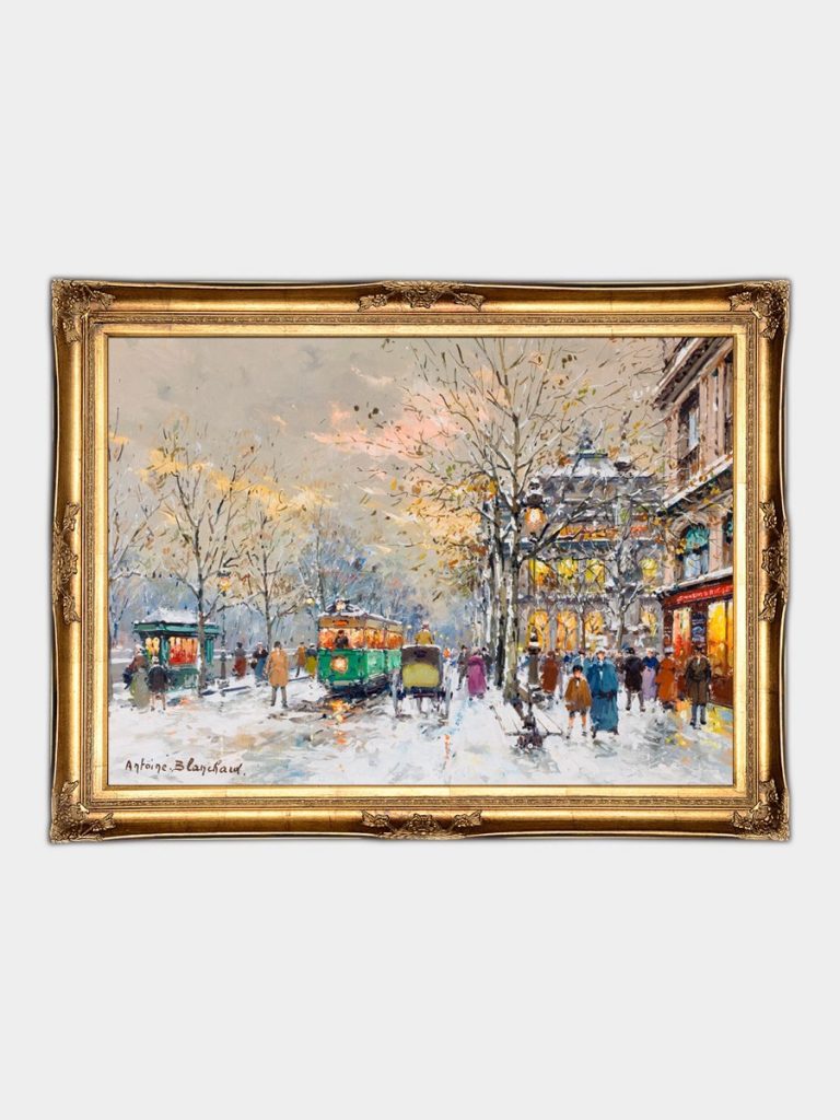
- Color Saturation Shifts: Objects in the distance should appear less vibrant than those in the foreground. Use paler, grayer versions of foreground colors for distant trees, mountains, or buildings. A distant pine tree might be painted with a mix of blue-gray and white, while a closer tree retains deeper greens and browns.
- Value Contrast for Focus: Strengthen contrasts in the foreground to draw attention. A dark evergreen tree against bright snow will pop, while the same tree in the background should fade into softer tones. This gradual shift in value (lightness/darkness) guides the viewer’s eye through the scene.
- Muted Midtones for Unity: Avoid harsh jumps between colors by incorporating muted midtones. For instance, blend a touch of violet into the blue-gray shadows of distant hills to harmonize with cooler foreground tones. These transitional colors bridge gaps between extreme lights and darks, creating cohesion.
Using Color to Convey Time of Day and Weather Conditions
- Sunrise/Sunset Hues: Capture the fleeting colors of dawn or dusk by introducing warm pinks, oranges, and purples into the sky and their reflections on snow. Paint horizontal bands of color in the sky, then drag a dry brush vertically through wet paint to blend them softly. Let these hues seep into the snow’s highlights and shadows for a unified, ethereal glow.
- Overcast Grays for Mood: For a somber, wintry atmosphere, replace vibrant blues with soft grays and muted lavender. Use a palette dominated by white, payne’s gray, and a hint of black to create a range of neutral tones. Add subtle texture with a palette knife to suggest snowflakes settling on surfaces, and keep highlights minimal to emphasize the cloudy light.
- Stormy Drama with Dark Contrasts: To depict an approaching storm, deepen shadows with indigo or black mixed into blue-gray. Paint jagged, dark clouds overhead and let their reflections streak across icy ponds or wet roads. Use broken brushstrokes to imply wind-driven snow, and introduce sparse touches of bright white for emphasis (e.g., a single snowflake caught in sunlight).
Incorporating Secondary Elements to Enhance Color Harmony
- Bare Trees and Branches: Paint winter trees with a mix of earthy browns, grays, and hints of red for bark. These warm tones contrast beautifully with cool snow, adding visual interest. Use a dry brush to scrape away paint on branches, revealing lighter underlayers that mimic frost or sunlight.
- Frozen Water and Ice: Represent ice with a spectrum of blues—from pale turquoise for thin layers to deep navy for thick ponds. Add white speckles for air bubbles trapped in ice, and use a palette knife to create jagged edges where ice meets snow. For frozen streams, blend greenish-blue into white to suggest depth below the surface.
- Human Traces: Footprints and Paths: Depict footprints or sled tracks with darker grays or blues to create leading lines through the snow. Soften edges with a blending brush to imply melting or wind-blown snow, and vary the width of tracks to suggest movement. A red scarf or bright coat on a distant figure can inject a pop of color, breaking the monotony without overwhelming the scene.
By experimenting with these approaches, you can transform snow from a static white mass into a dynamic, story-rich subject. The interplay of cool and warm tones, strategic layering, and attention to atmospheric effects will ensure your snowscapes resonate with both realism and emotional depth, inviting viewers to step into the winter wonderland you’ve created.